Beautiful and Free Unicode Typefaces, for editor and printer (including a comparison of Latin Modern and Computer Modern Unicode)
For my academic papers, I often need a typeface with a wide range of characters and diacritic combinations. Basic diacritics are supported by a wide range of fonts, but more specialised diacritics and particularly combinations of diacritics only work well in a handful of typefaces. I write my papers in TeX, which has two components: the typeface used to set the paper in (La)TeX and the typeface/font used inside Emacs, where I write the papers.
Typeset typefaces #
The choice of typeface is particularly relevant for using XeLaTeX or LuaLaTeX, where the standard default unicode typeface family is Latin Modern, based on Donald Knuth‘s original Computer Modern family of typefaces designed in METAFONT, and the general recommendation is to use Latin Modern rather than the earlier Computer Modern Unicode.
Generally reasons given for preferring Latin Modern include the fact
that Latin Modern involves handmade vectorisation, with revised
metrics, and additional glyph coverage, including particularly
diacritic characters; whereas the Computer Modern Unicode fonts were
converted from METAFONT sources using mftrace with autotrace backend
and fontforge (former pfaedit) automatically.
Some of the revised metrics of Latin Modern include arguably better positioning of acute and grave accents, more appropriately-sized umlauts, and (here tastes may vary) a better looking Eszett (ß).
[Note that throughout this post, you can right-click on the images and select “View Image” to see a larger/zoomable version of the image.]
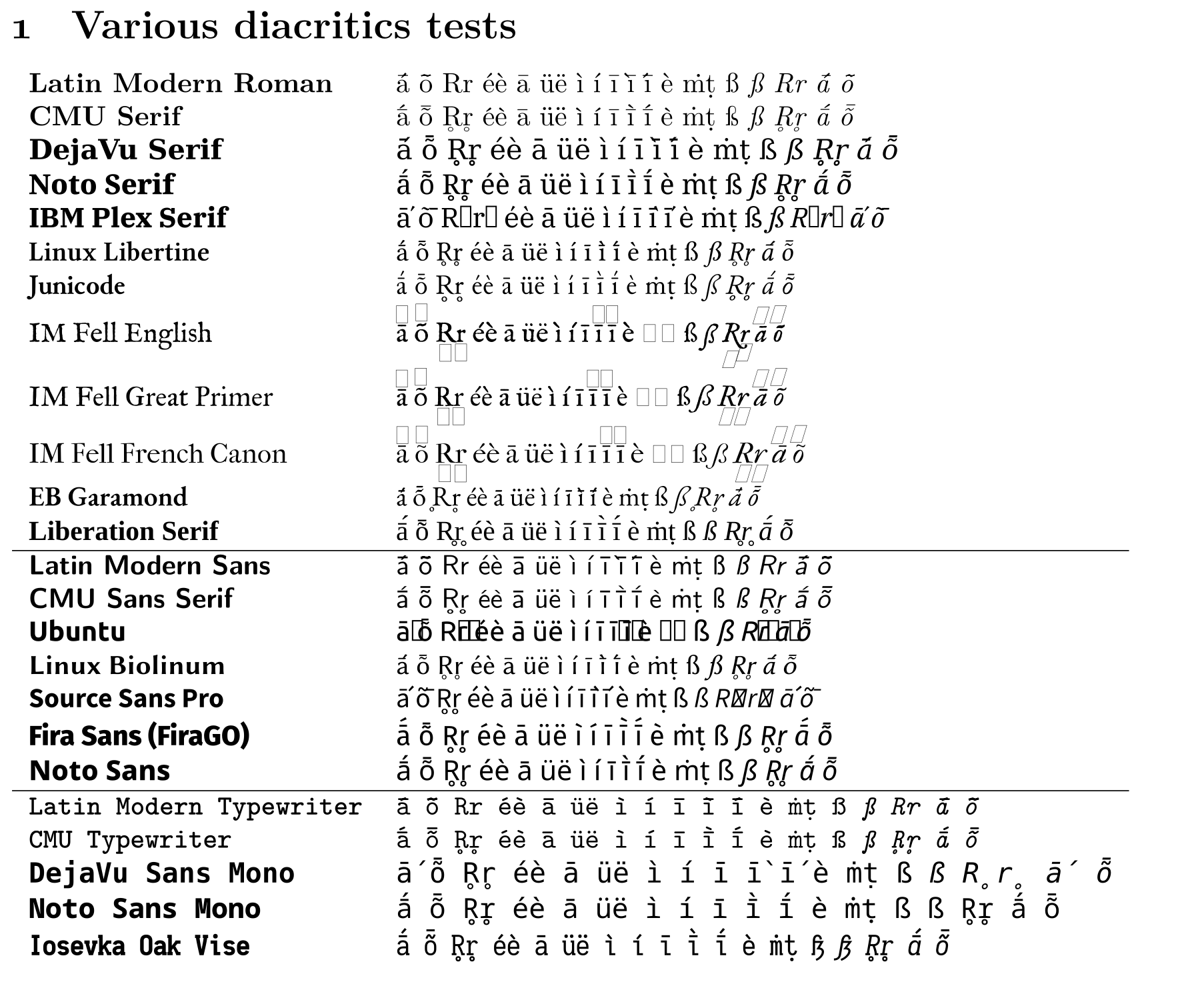
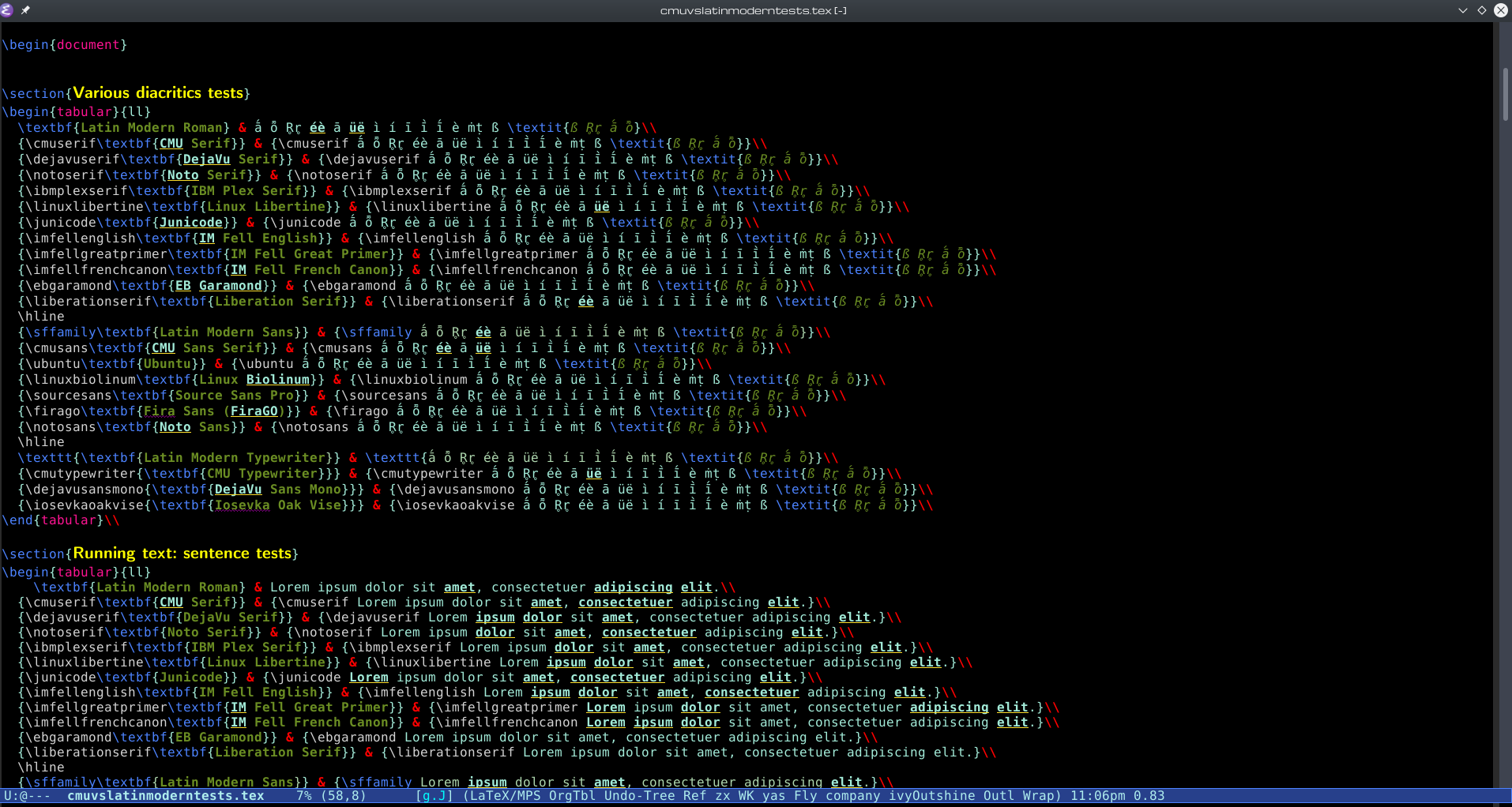
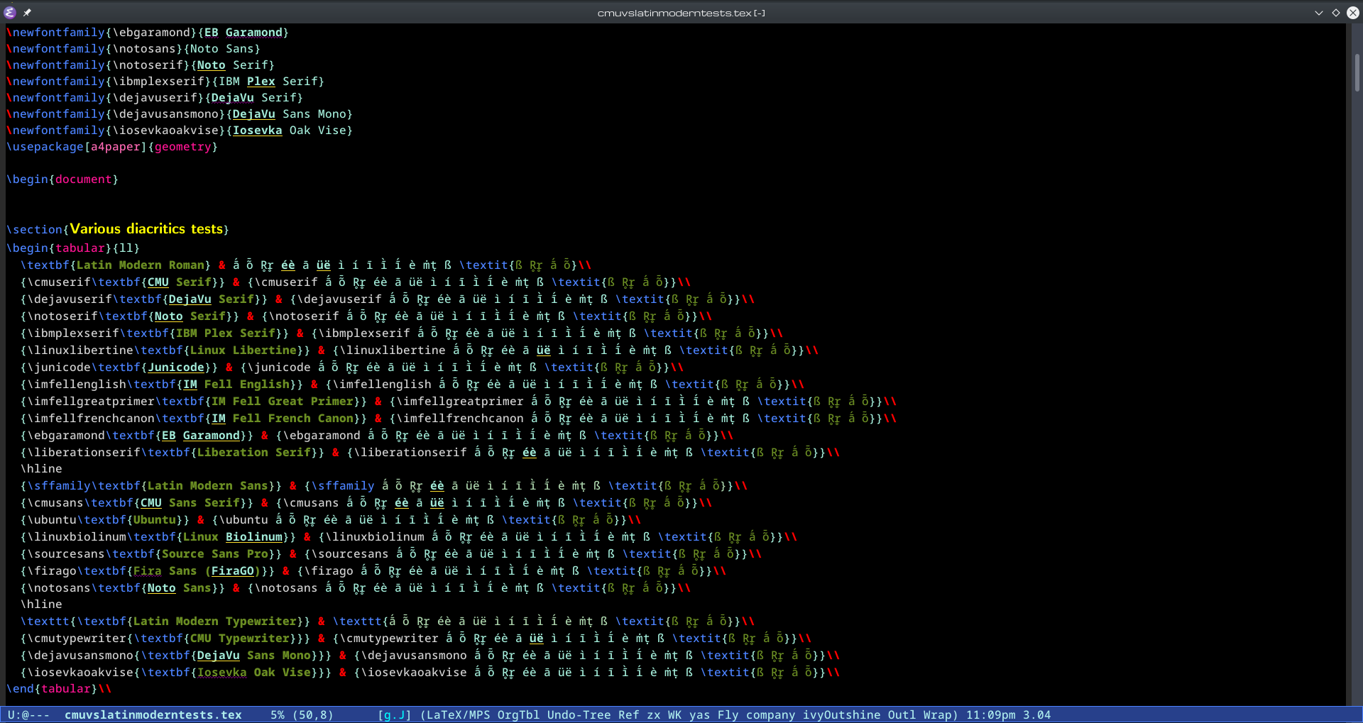
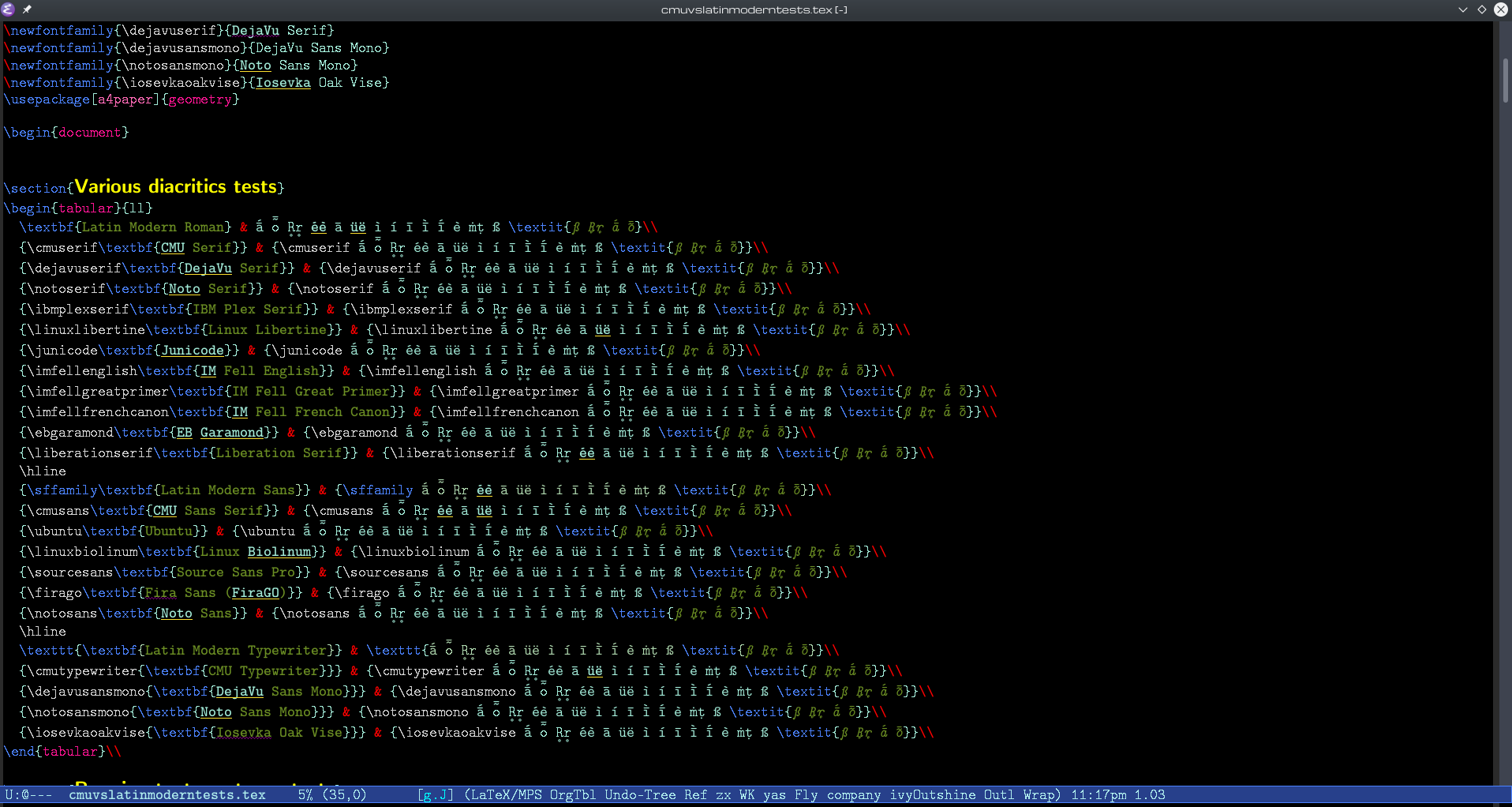
However, in my tests, Computer Modern Unicode actually performs better at least with respect to handling diacritics. In fact, Computer Modern Unicode is one of a handful of typefaces which actually properly handle a large range of diacritics and combinations of diacritics, as can be seen in the image below, showing a variety of serif, sans serif, and monospace typefaces, respectively, typeset in XeLaTeX:
[The source file from which all of these samples were generated is included below in this footnote: 1.]
Note that in many typefaces, including all of the Latin Modern faces, combinations of acute accents and macrons (e.g. the first character in the tests: ā́, also not handled well by IM Fell Great Primer, the font this blog used to use for its body text; now switched to Computer Modern Unicode Sans) are very poorly handled, often with the accent and macron being overlaid, rather than the accent properly stacking on top of the macron.
Even fonts that properly handle this often fail for other diacritics: note that EB Garamond and Liberation Serif don’t seem to properly handle underrings (e.g. R̥r̥, also not handled that well by IM Fell Great Primer).
Even the Linux Libertine faces (here represented by their Libertinus continuations), which overall fare well, don’t handle the acute+macron combination well in the italic version ā́.
Thus the only serif faces which handle the full range of characters/diacritics are the didone (a style arising in the late 18th-century, popular in the 19th-c.) Computer Modern Unicode; Junicode (based on a 17th-century font used for George Hickes‘s Linguarum Vett. Septentrionalium Thesaurus); and the early 20th-century styled Times New Romanesque Noto Serif.
For the sans serif faces, in addition to the Computer Modern Unicode Sans Serif face (in some ways a ‘skeletal’, un-didone-ised version of Computer Modern Roman), Mozilla’s Fira Sans (here represented by FiraGO, an updated/extended version), and Noto Sans – the latter two both being vaguely ‘humanist’ sans serifs, though Noto Sans perhaps has some ‘american gothic/grotesque’ features – also manage the full range of characters/diacritics, but doesn’t have an italic face.
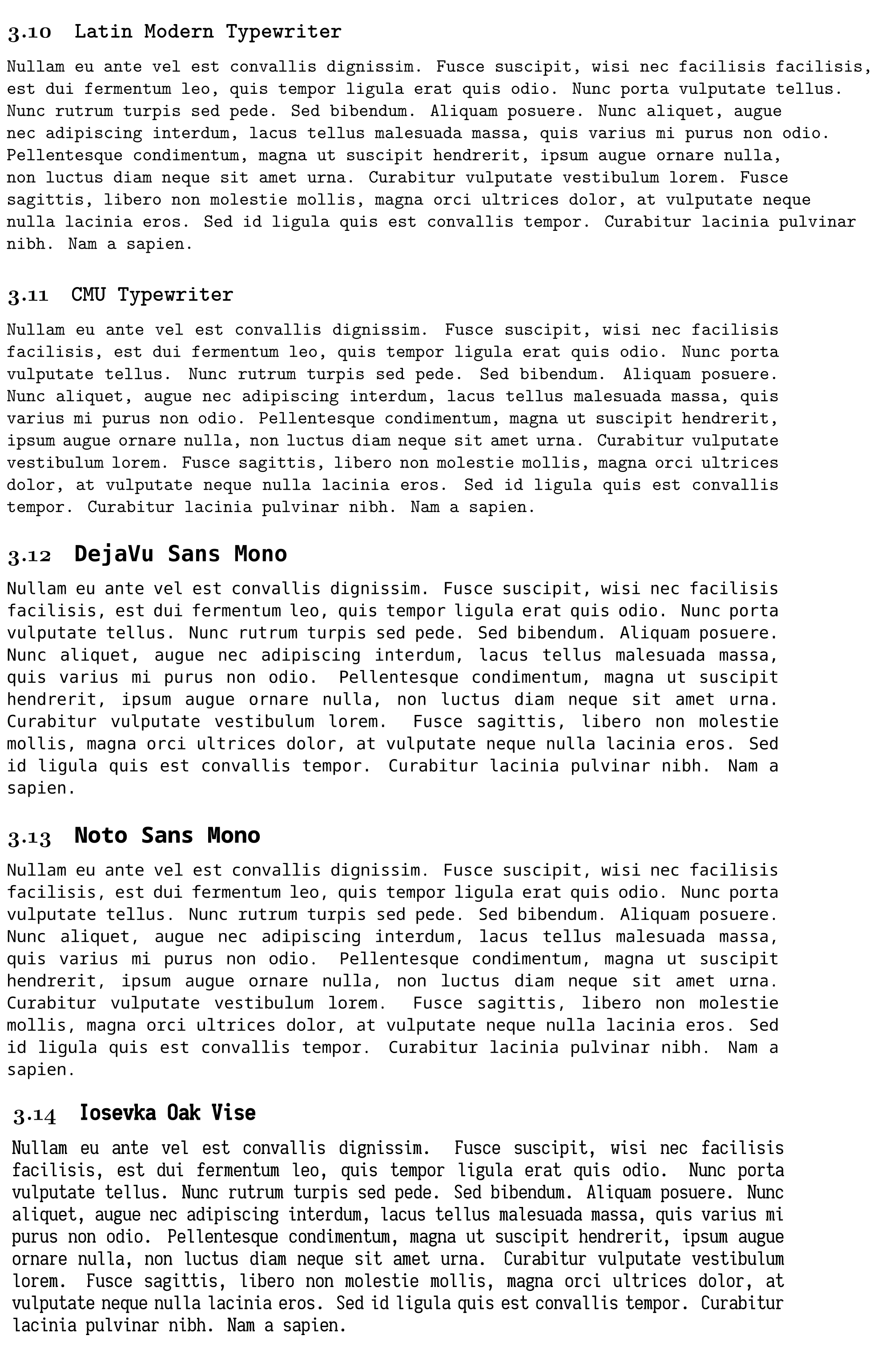
For the monospace faces, again the Computer Modern Typewriter face (an ‘Egyptian’ typewriter face, not unlike Courier) manages the full range of characters/diacritics, as do Noto Sans Mono and the Iosevka faces (here represented by my own customised version, Iosevka Oak Vise).
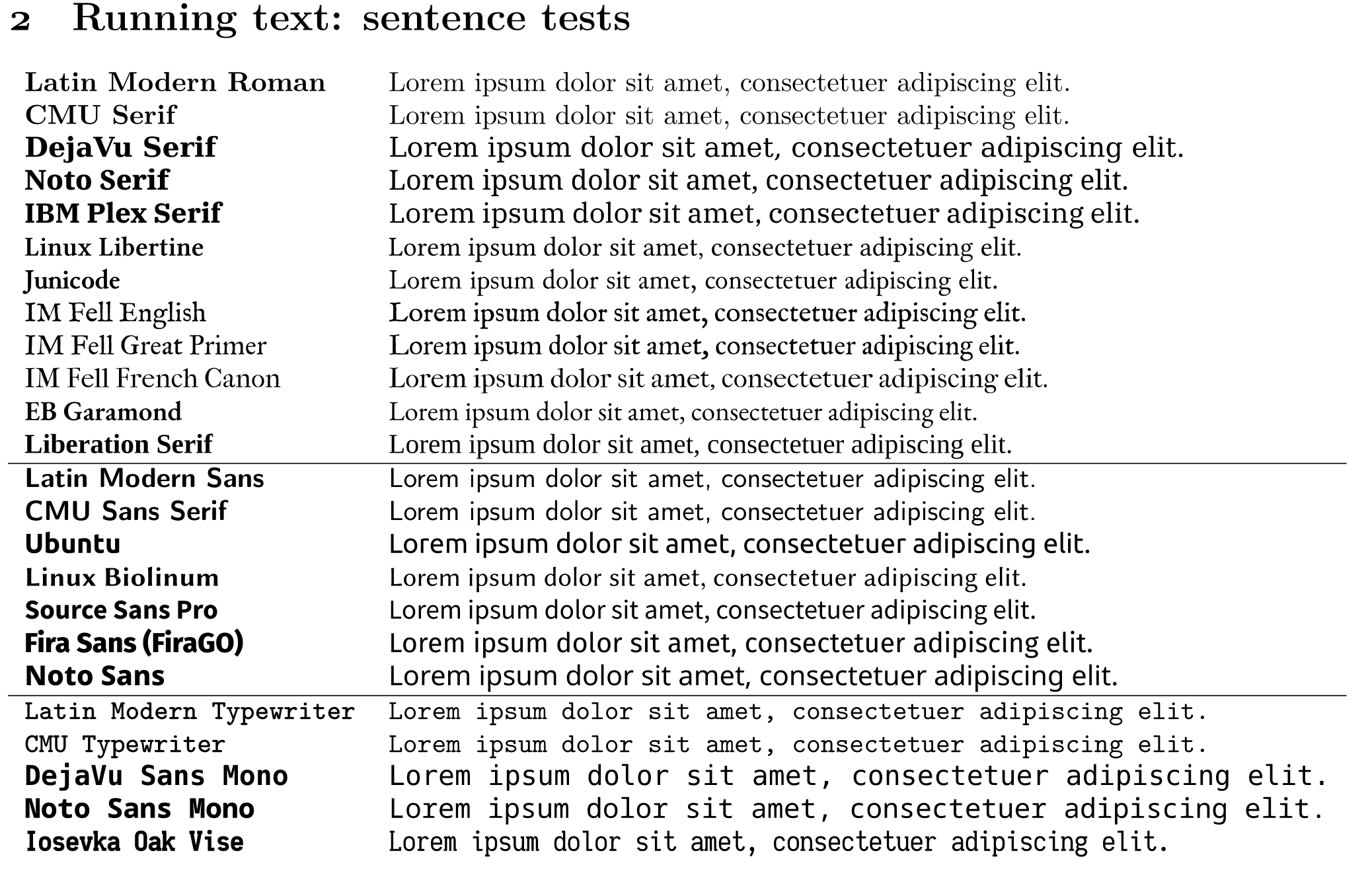
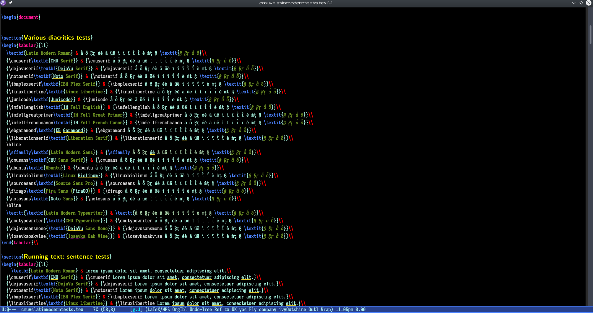
Not all of these typefaces are of equal beauty. Here are some examples of running text, single sentences first:
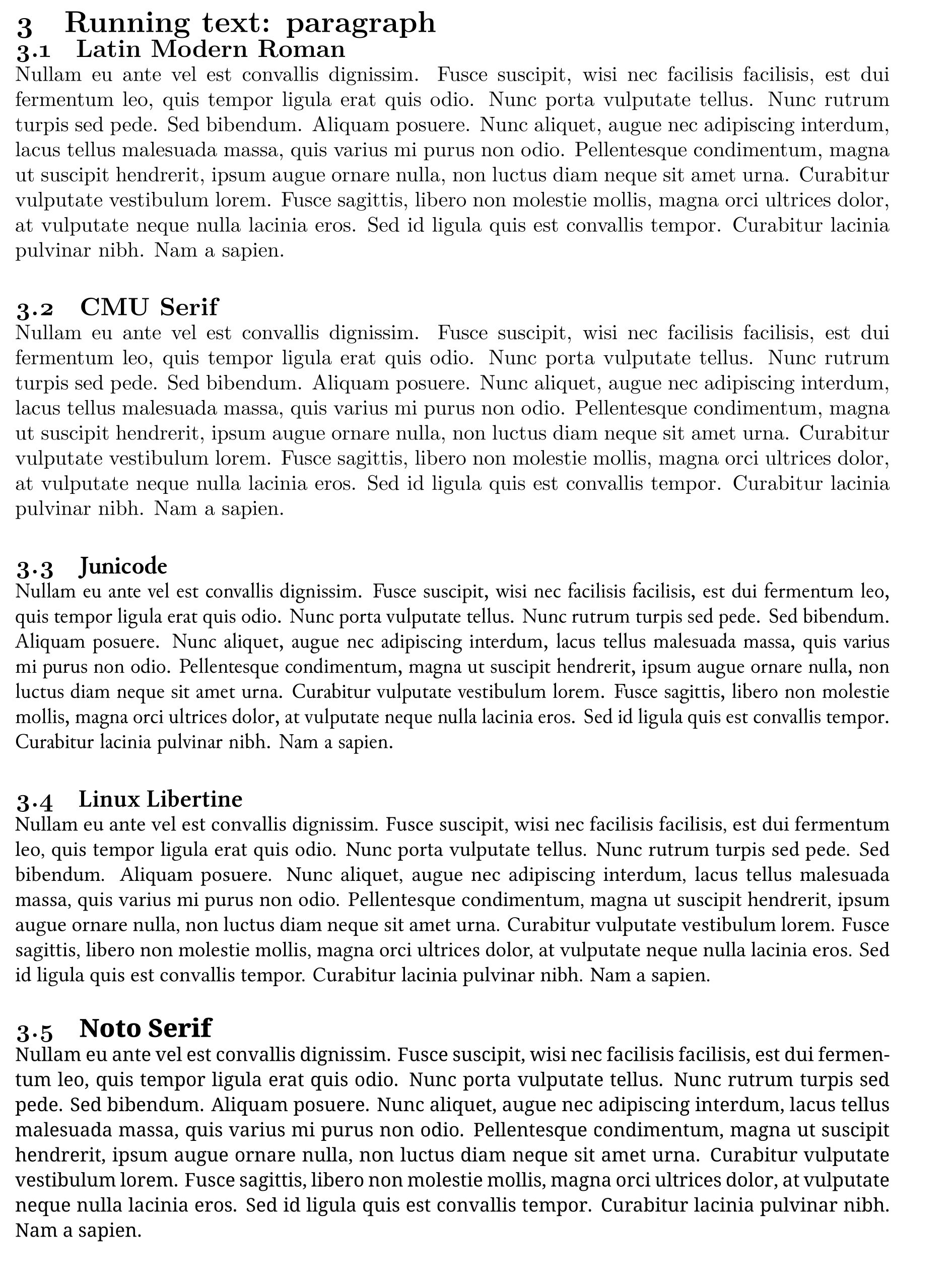
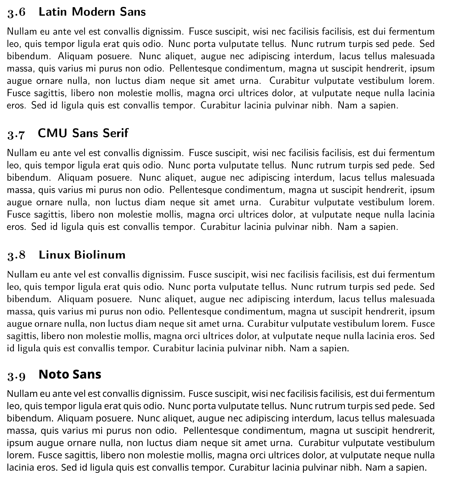
And full paragraphs (for a subset of the typefaces; only including those that manage at least a majority of the characters and diacritic combinations):2
Only a few typefaces handle the full range of characters and diacritic combinations. For the serif faces:
- CMU Serif
- Noto Serif
- Junicode
For the sans faces:
- CMU Sans Serif
- Noto Sans
- Fira Sans (FiraGO)
For the monospaced faces:
- CMU Typewriter
- Noto Sans Mono
- Iosevka
Here is a comparison only of these “winners” (and Noto Sans Mono perhaps is not a winner, lacking an italic face):
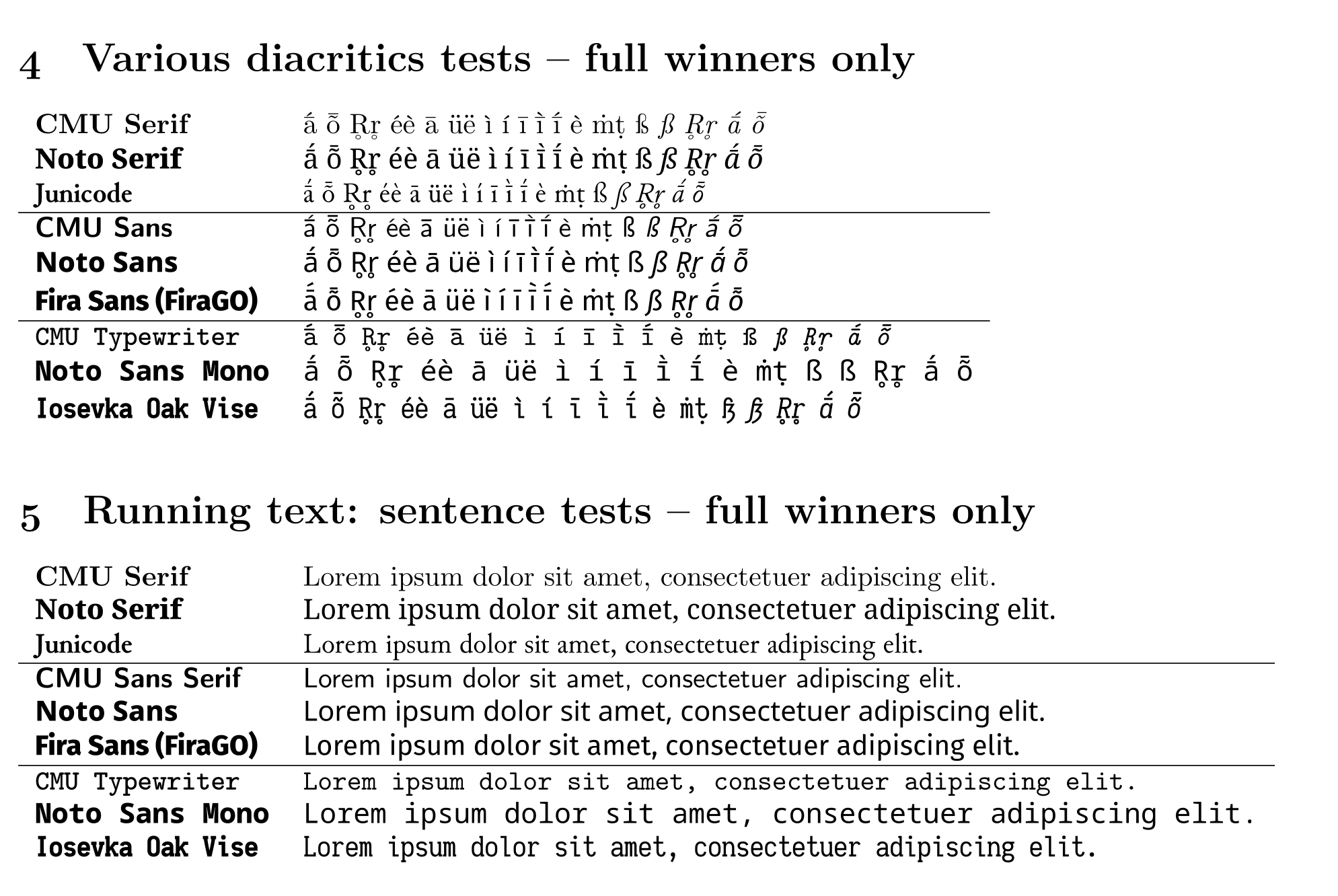
So, if you want to use a font family with good performance across the full range of fonts, Computer Modern Unicode (CMU) or Noto seem like the best bets, and the former is much more aesthetically-pleasing than the latter (in my opinion), which also lacks an italic font for its mono version. Junicode is also a beautiful and very functional serif face, which I often use.
The Latin Modern faces turn out, despite the received wisdom, to be inferior in terms of diacritic coverage, and switching from Latin Modern to Computer Modern Unicode (CMU) has significantly reduced the amount of frustration I have in trying to typeset my papers.
Editor typefaces #
The editor font is the one I spend most of my time staring at, so I also want something good here too.
Despite DejaVu Sans Mono apparently not properly rendering all character/diacritic combinations in LaTeX, it handles all of these perfectly well when used as the default font in Emacs:
DejaVu Sans Mono was for many years my preferred font for Emacs (and I assume DejaVu Sans Mono-derived fonts like Menlo or Hack will also behave well).
Noto Sans Mono also works fine, but it’s not my favourite:
CMU Typewriter, despite rendering well in LaTeX, has problems with
certain combination when used as the Emacs font, and anyway doesn’t
look as good as the other choices as an editor font for whatever
reason:3
These days, I prefer to use a customised version of Iosevka, which also handles all of the characters/diacritic combinations perfectly:
I plan to write more extensively about Iosevka in another post.
Summary: Best Bets #
For typesetting papers requiring a full-range of unicode roman characters and diacritics (for non-roman, the Noto fonts are great), the Computer Modern Unicode (CMU) faces4 are the best bets, along with Junicode.
For editor work requiring a full-range of unicode roman characters and diacritics, use a DejaVu Sans Mono font or derivative, or one of the Iosevka variants.
-
I’m not sure why Latin Modern Typewriter ends up with a ragged right margin. ↩︎
-
Ubuntu Mono, when I tried setting it as the default font in Emacs and opening the
.texfile from which the pdf screenshots shown here were taken, caused Emacs to crash! ↩︎ -
E.g., CMU Serif, CMU Sans Serif, CMU Typewriter; there are a number of others, including also CMU Concrete Roman, used below for the non-title text (the title text is set in Latin Modern Dunhill):
 ↩︎
↩︎